Logo & Business Cards
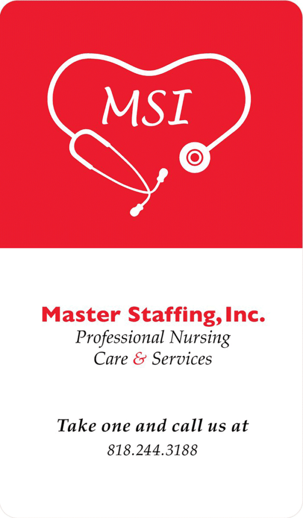
Since the company’s logo was not scalable, I had to create a new one that was sleeker and more relevant to the company’s identity.
The registry is smaller than its national competitors and caters to the needs of its nurses like they are family, so I tried imbue that into the logo and business cards.
The business card design is a play on medication pills. Die cutting the card into the pill shape proved to be too expensive, so we settled on rounded corners.

Website
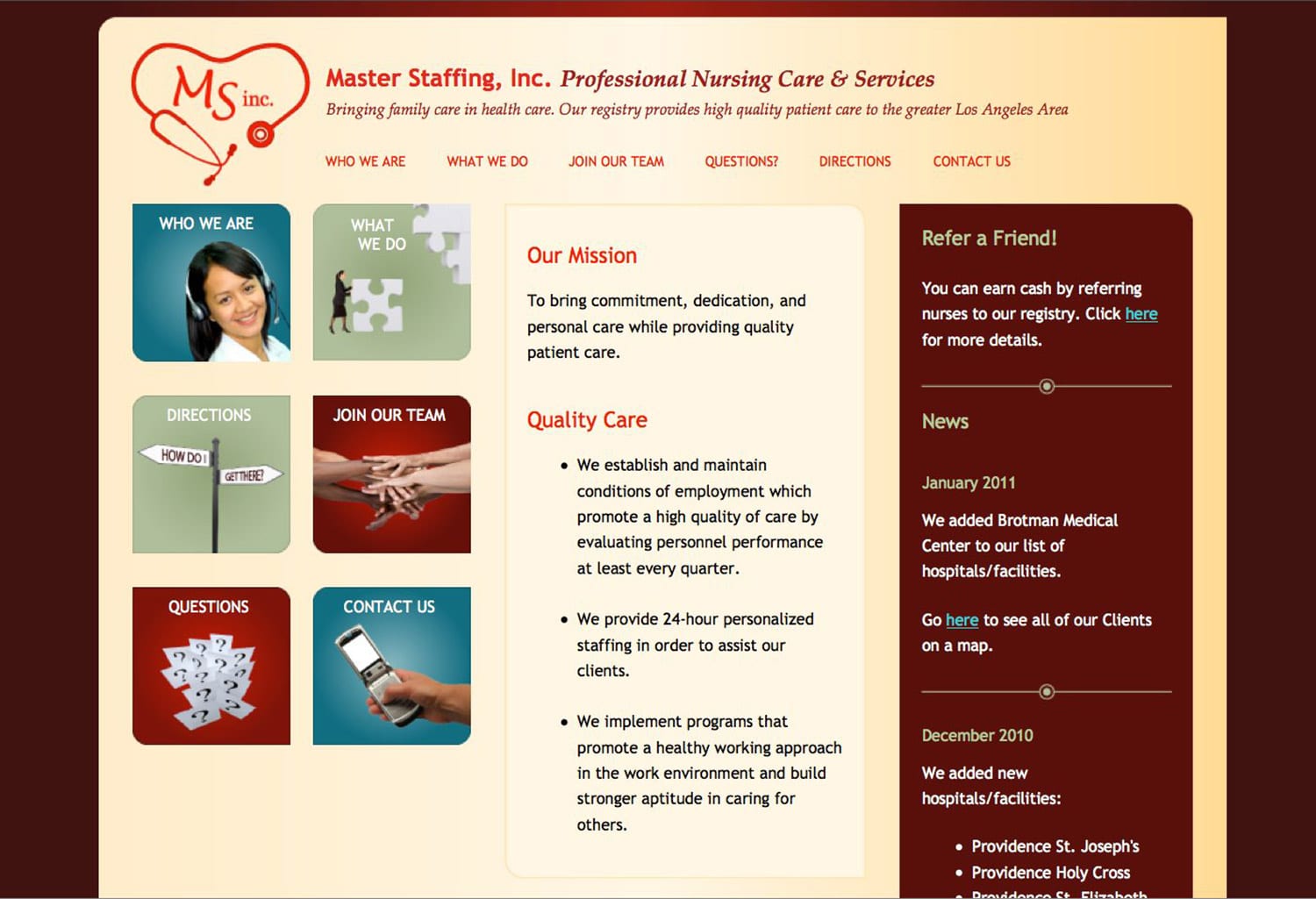
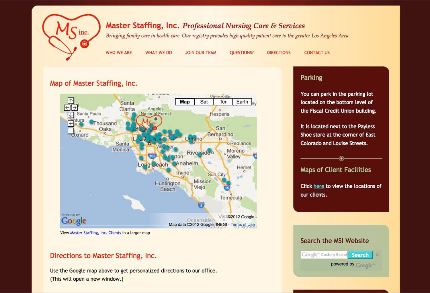
I created the website to attract new applicants, using HTML and CSS. It provided clear answers to their most frequently asked questions.
I later revamped the website to be responsive. The new site has a fresher look and provides a constant call-out at the top for new applicants.

