Concept
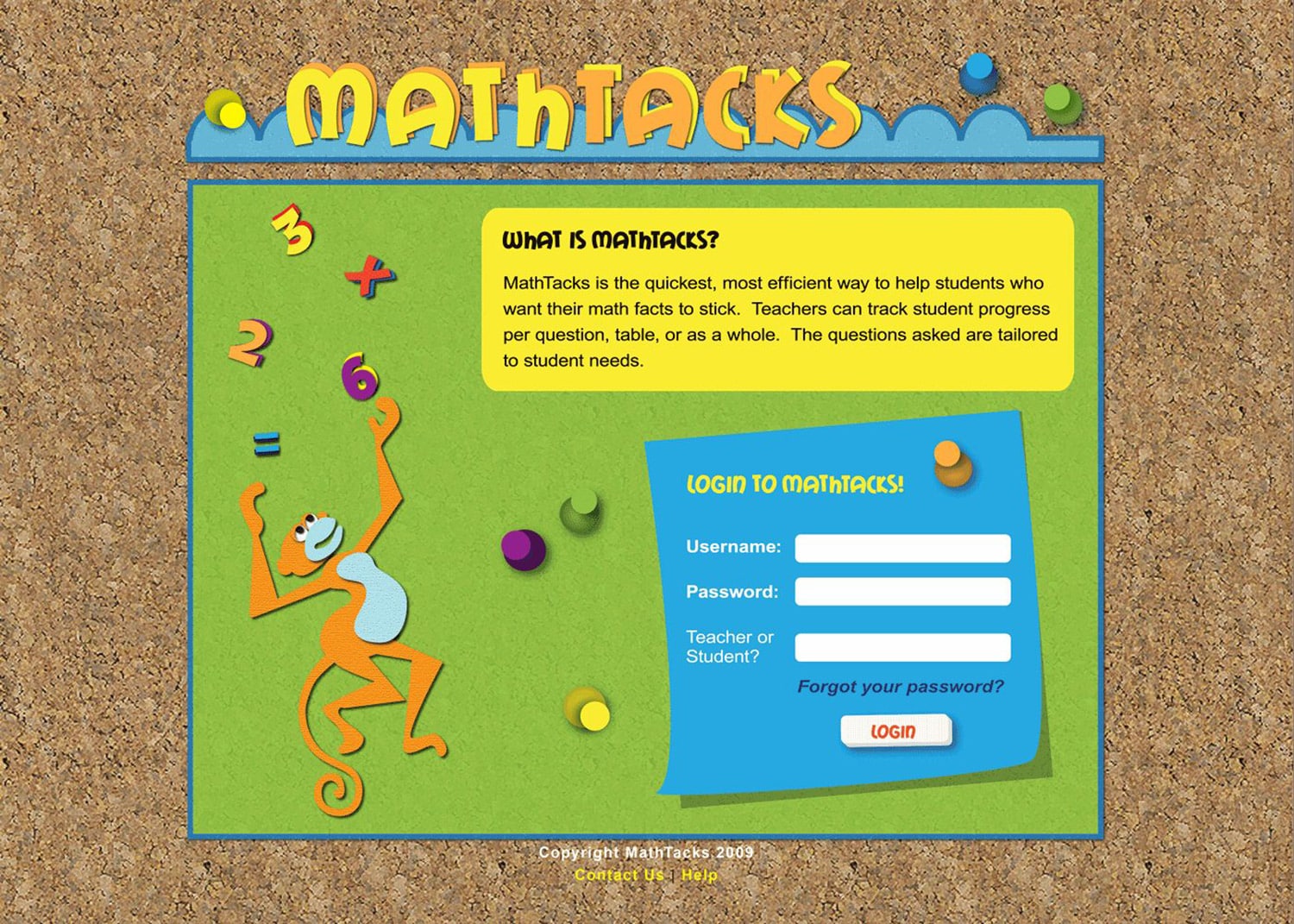
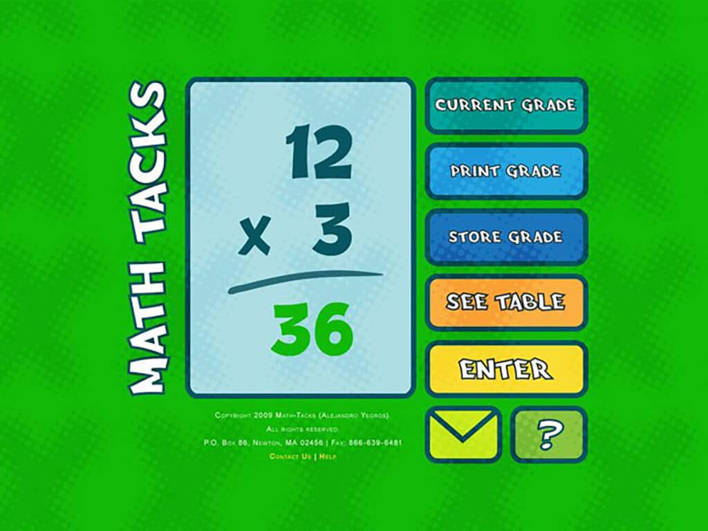
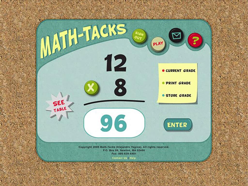
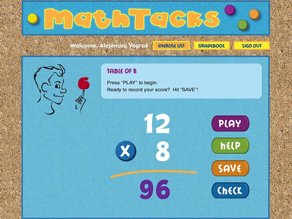
The target audience for the site was grade-school aged children, so it had to feel fun enough to make them forget they were doing math. I tried a few themes with bright colors and eventually settled on a cork-board and cutout theme. After designing the layout, I wrote the CSS for all of the website elements.
Mascot
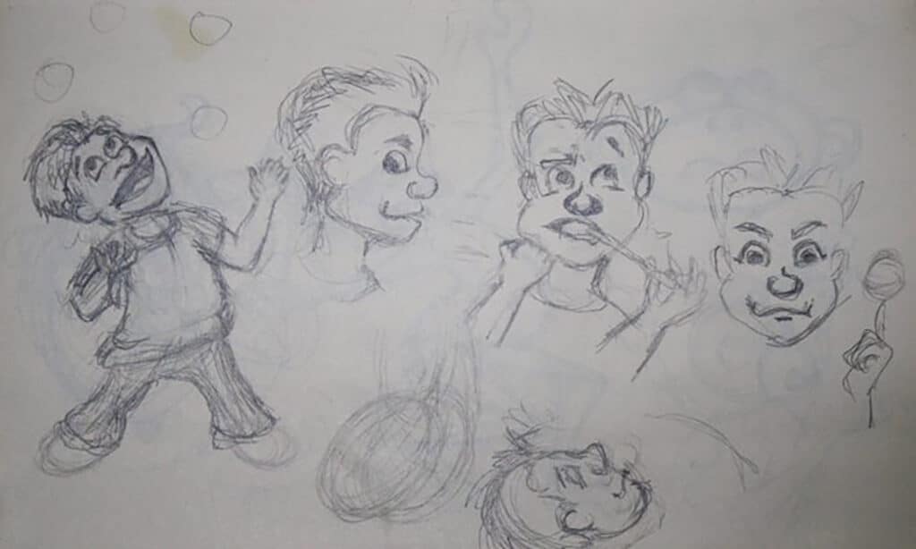
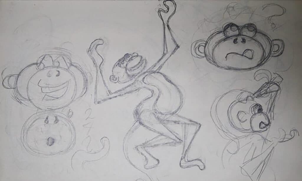
The owner wanted to use an animal mascot so that it could be broadly appealing and gender-neutral. I came up with a monkey juggling numbers to add a sense of playfulness.
Brochure
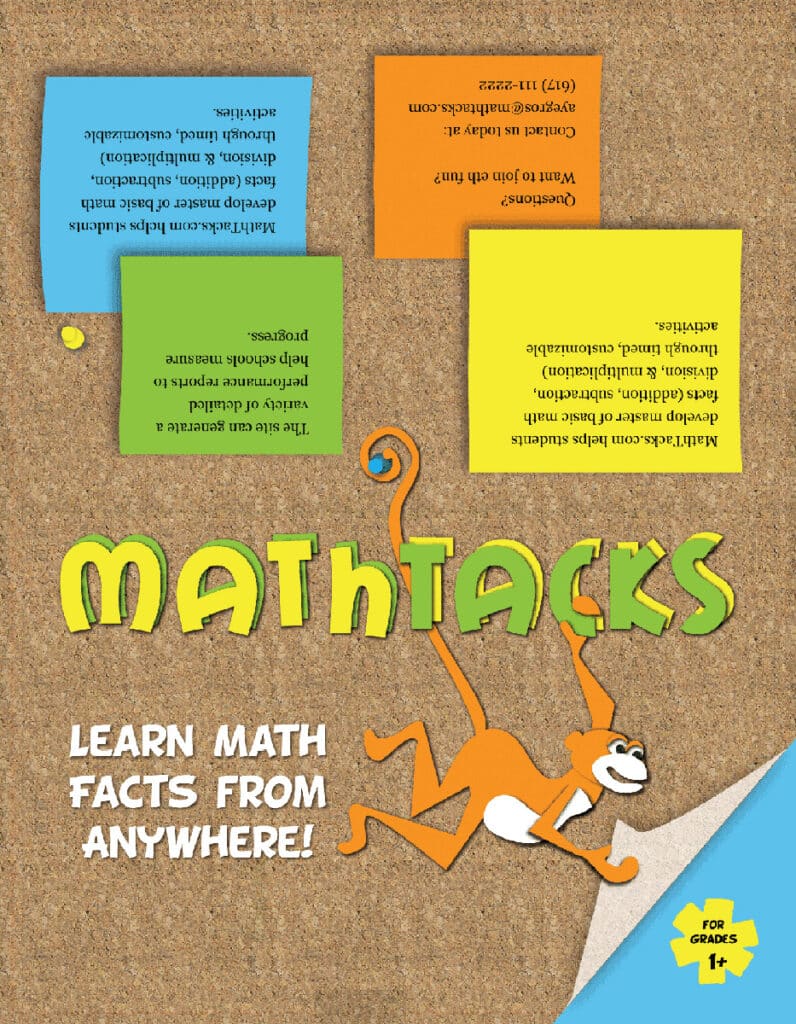
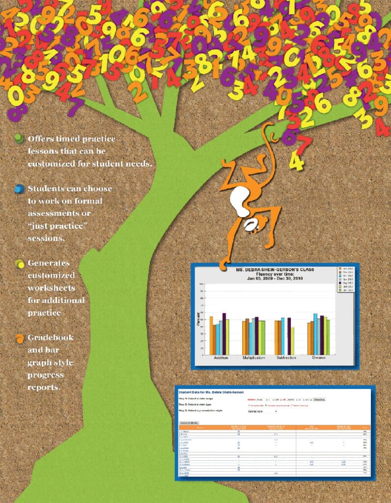
For continuity, the brochure used the same theme and mascot. If I could do it again, I would tone down the theme since the brochures were aimed at school administrators.
The owner wanted the ability to edit the text on the outside of the brochure to direct the brochures to specific schools and teachers, so I made the brochure into an editable pdf form.
Website
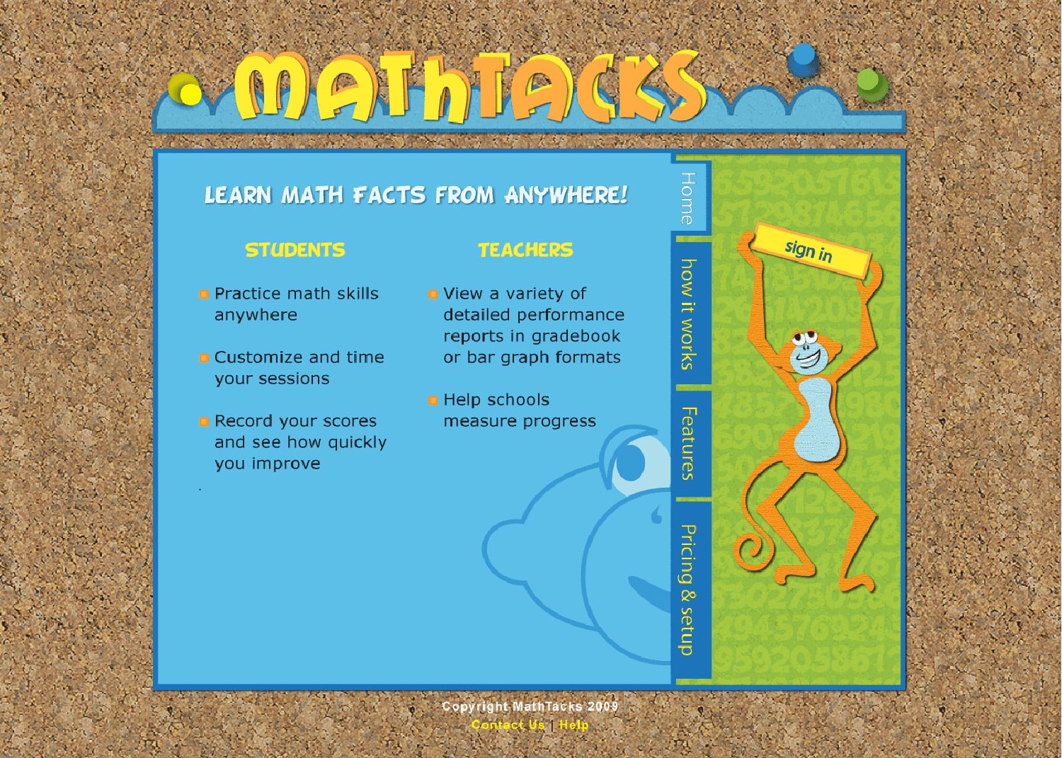
I carried the tactile cutout theme to the website, but I should have considered common website conventions. The navigation is not suitable and would be confusing to users.
