Concept
Asha had heard that the term “stale cake” was used by the Japanese to apply to women past their marrying age and thought it would be a great title for our project.
We decided to capitalize on the name of the comic and embrace a cake store theme. This freed us to have more fun with the copy on the site and to differentiate Stale Cake from other web comics.

Logos
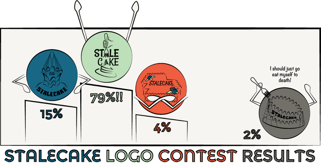
In all of our logos, I really tried to convey the staleness quality, without being so disgusting that you wouldn’t want a piece.
To drum up interest in our stalecakecomic.com site, we posted a contest and let people vote for their favorite logo.

Website
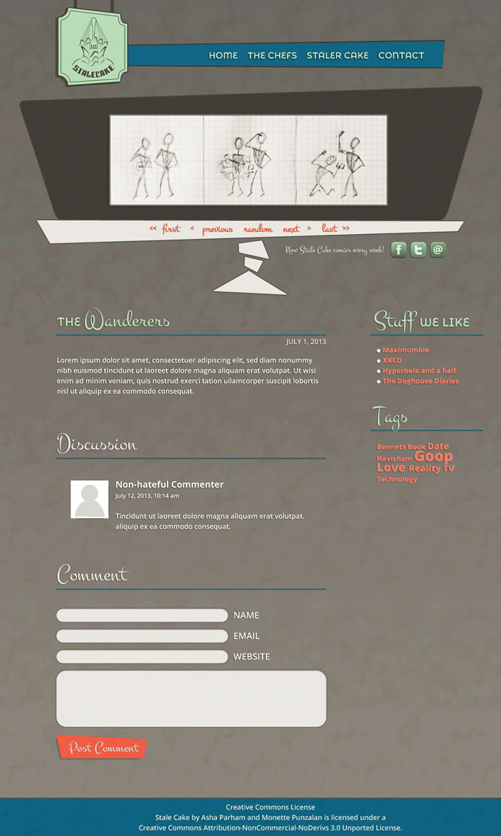
Initially, I wanted to capitalize on the name of the comic and embrace a cake store theme. I focused too much on the “stale” aspect with a color palette of heavy greys and browns.
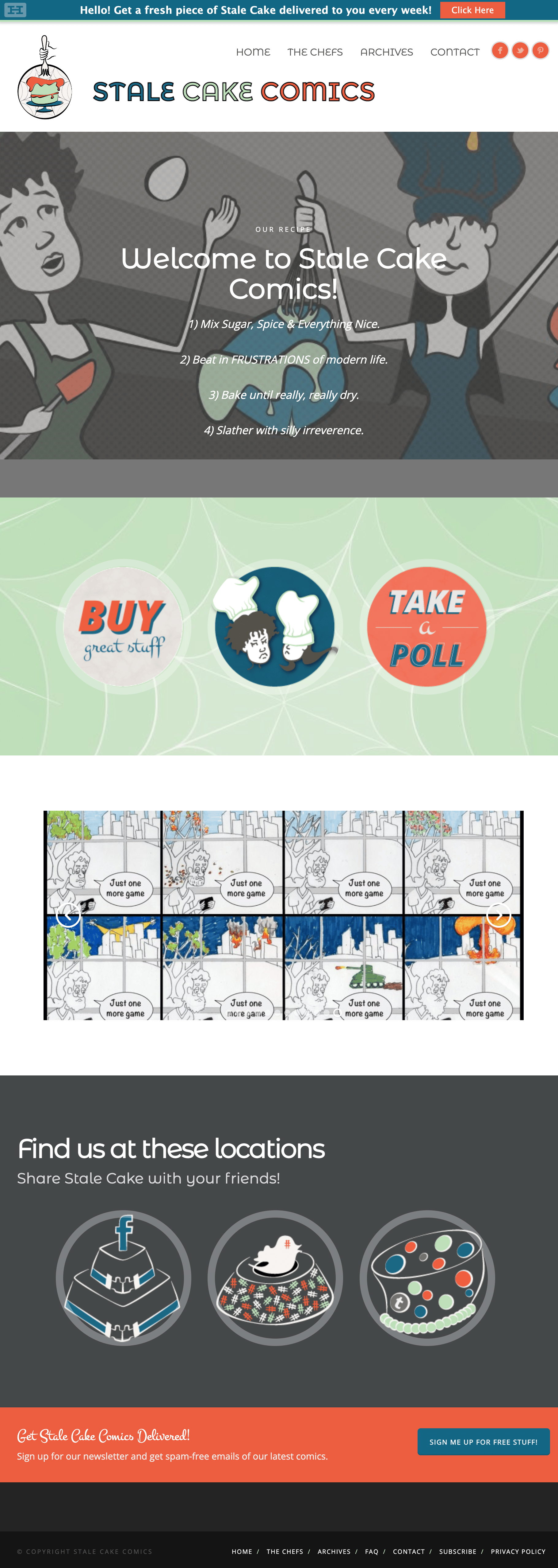
The final version of the site used the bright pastels carried throughout the comics. The larger font sizes made it more accessible and fit the lighter theme.

