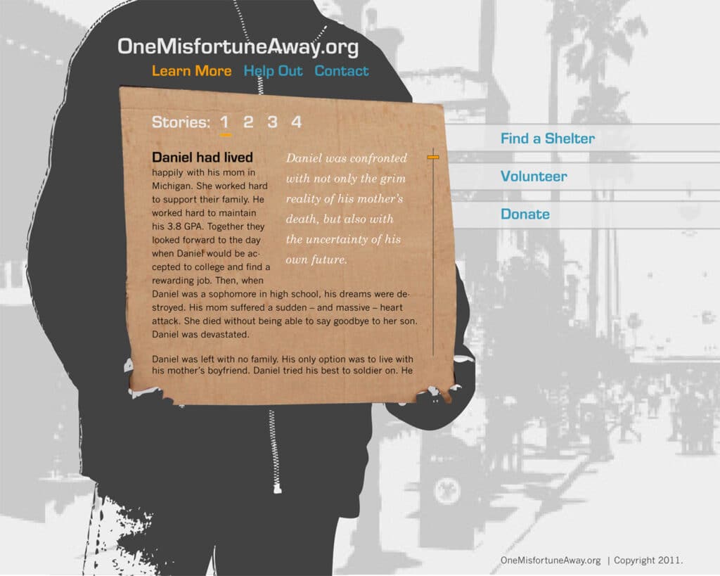
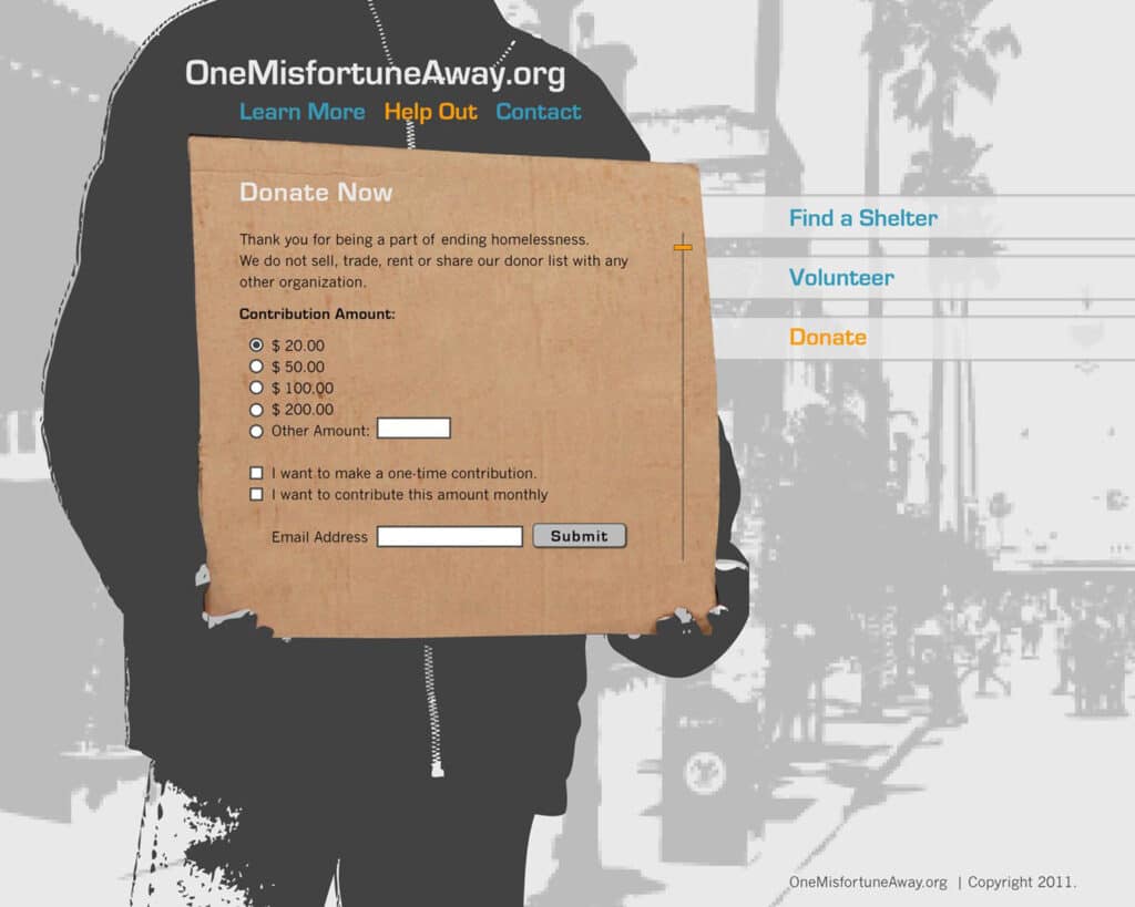
Concept
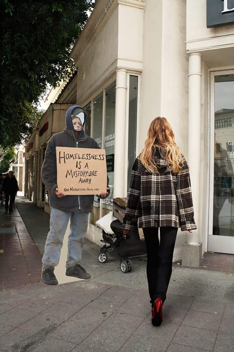
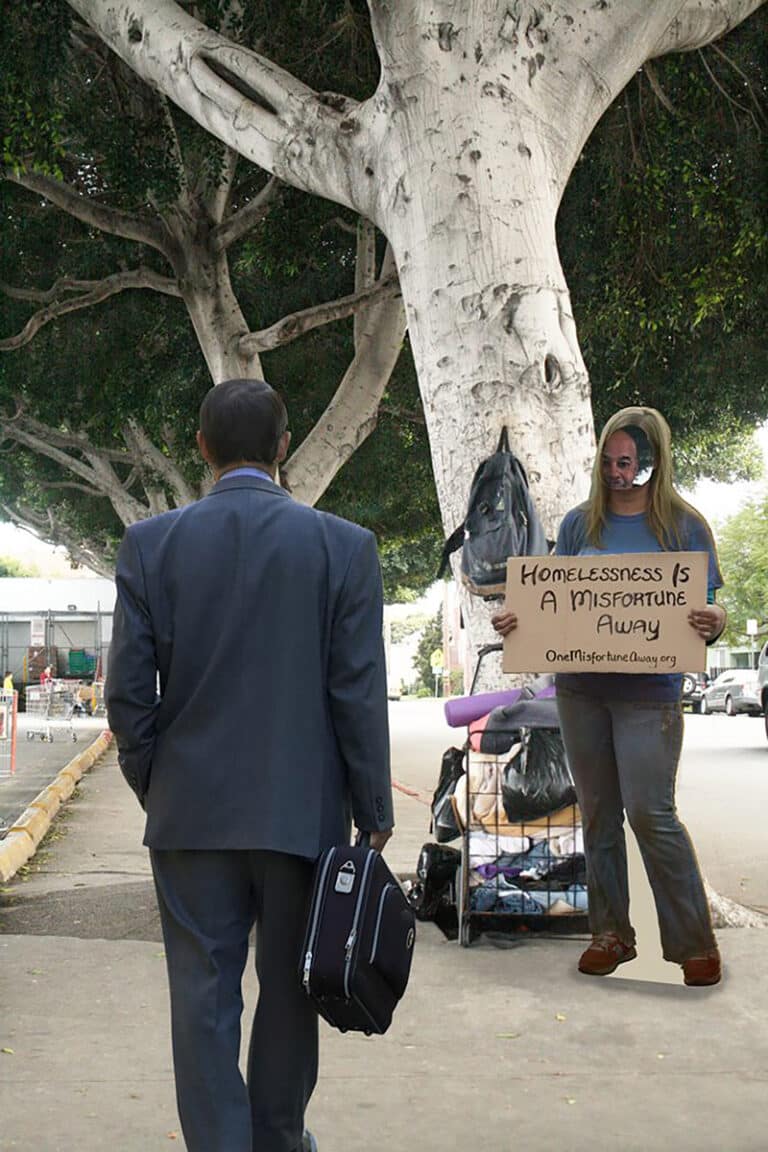
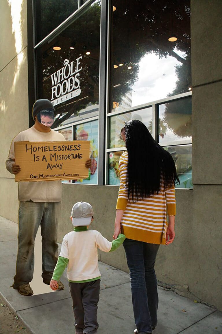
To make people put themselves in the shoes of a homeless person, I created life-size cardboard cutouts of homeless people with mirrors for faces so when people would pass by they would literally see themselves. The signs that the homeless people carry directs people to the website for more information on where and how to help.
Initial Website Mockup
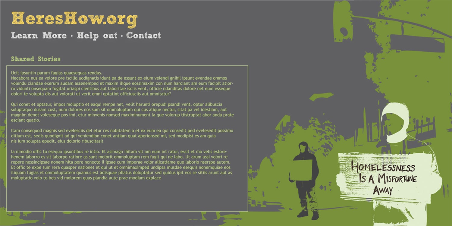
This initial mockup of the site made the cause look environmental because of all of the natural colors. So I ended up going in another direction, but the layout was a better choice than my final one.
Final Website Mockups
The let the images of the cutout guerrilla ads take over my website mockups. They did not allow much room for the actual information. I had a flash based version in my mind instead of a responsive one. Also, the multiple navigation menus on the side and along the top would be confusing to users.
