Concept
The creator had a Puerto Rican background and wanted to feature it in the logo and graphics. He wanted a lush look that featured coqui characters to appeal to students. He admired the artist Rufino Tamayo, and wanted me to incorporate aspects of his style in the graphics.
User Roles
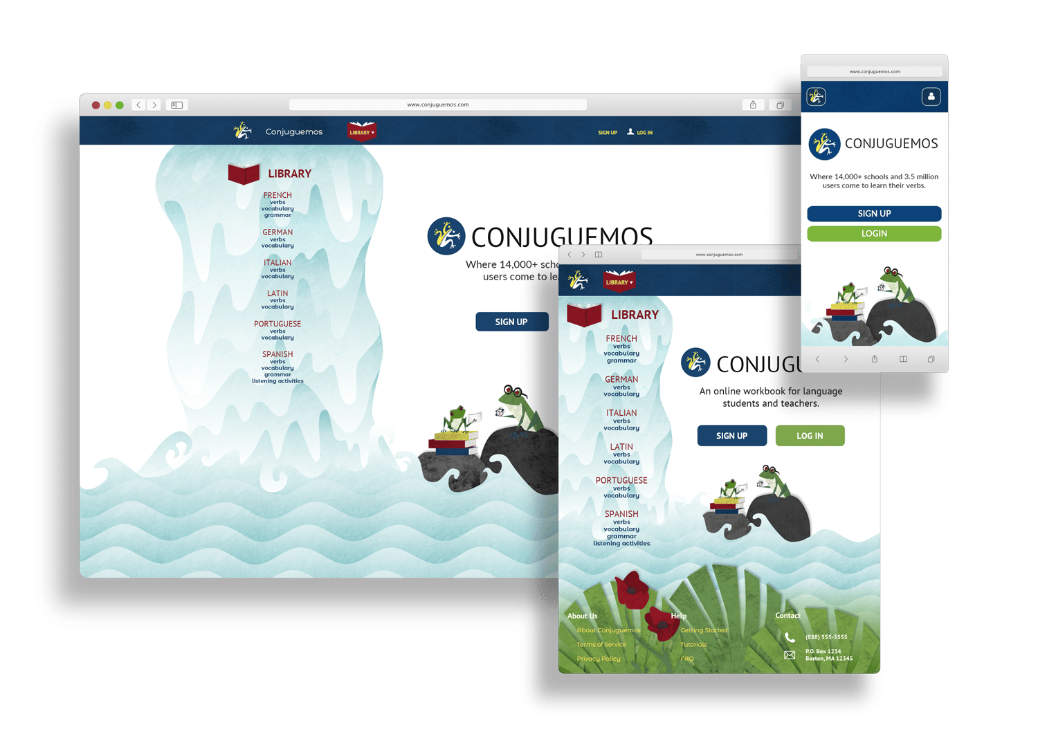
While the look had to be engaging for the students, I had to account for teacher and school administrator users. I kept the color theme for non-student users, but streamlined the look by removing many of the graphics.
Challenges
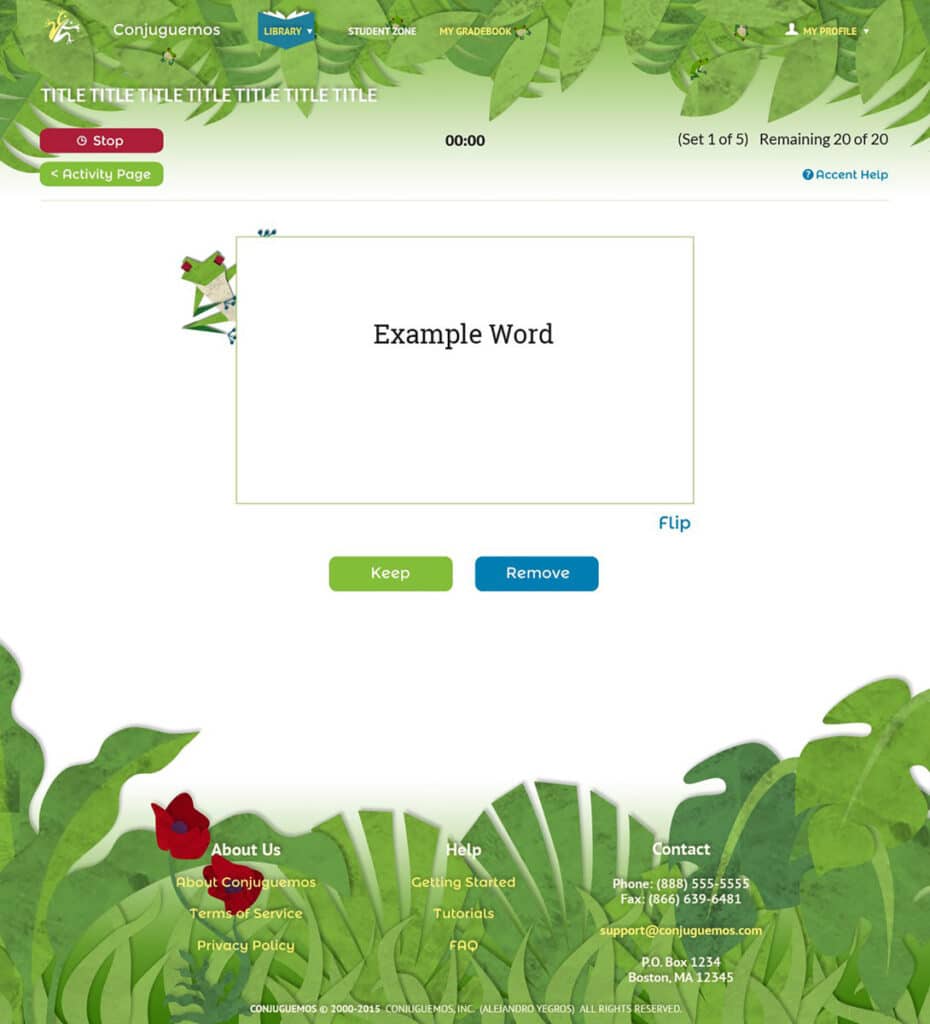
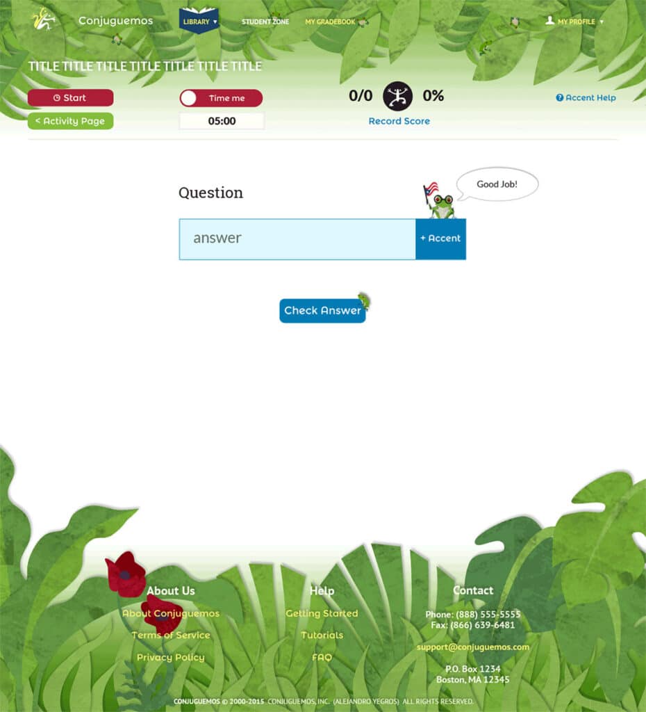
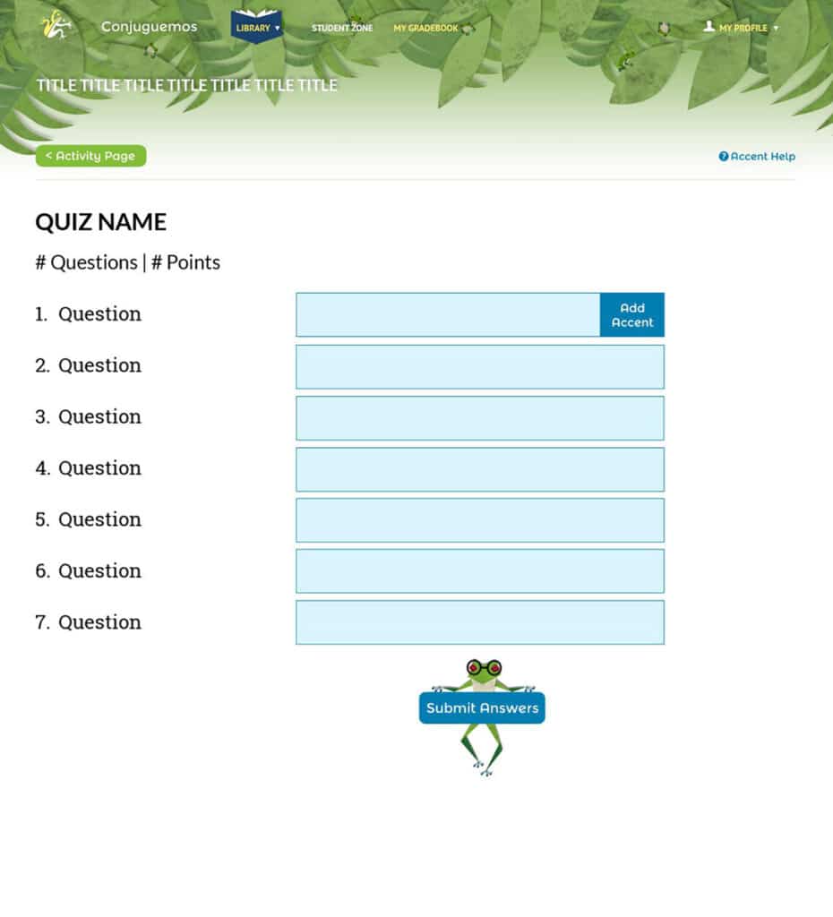
The initial challenge concerned mixing complicated textured graphics in a responsive way. I figured out how to use specific leaves and frogs on different layers that would move differently when the screen was resized. The result was unique looked very different from the flat style that was popular at the time.
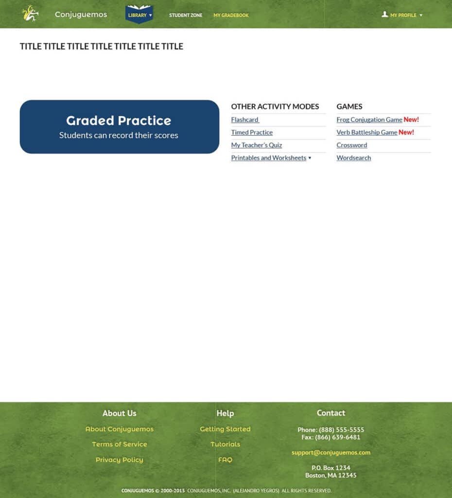
The next challenge involved positioning the buttons, links, timers in a logical way, that wasn’t overcrowded.
The redesigns and iterations occurred throughout the year as more features were added to the program. In retrospect, with the UX knowledge I have now, I should have:
- • Drawn out user flows for each activity
- • Used sketched low-fidelity wireframes to save time on iterations
- • Started with a mobile-first approach to creating the wireframes, especially with so many buttons and timers that were part of the activities
- • Employed user tests for the features to see how students interacted with the interface for each activity
Games
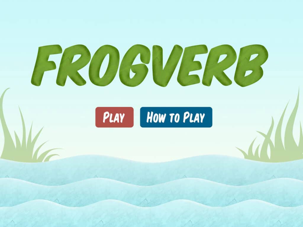
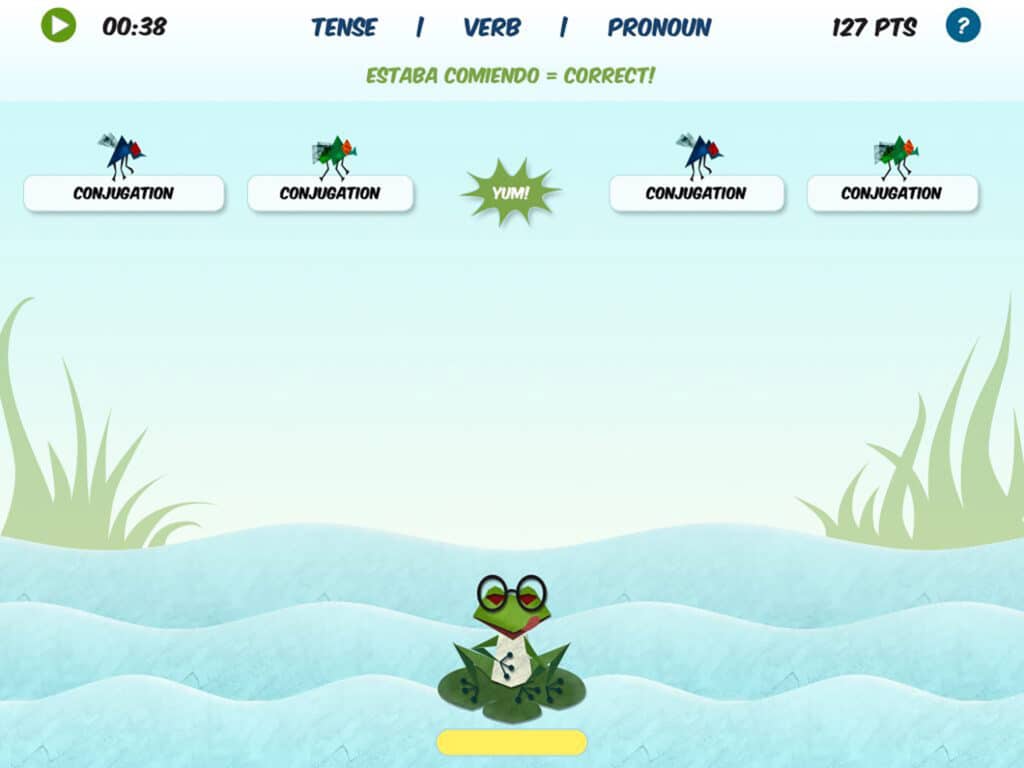
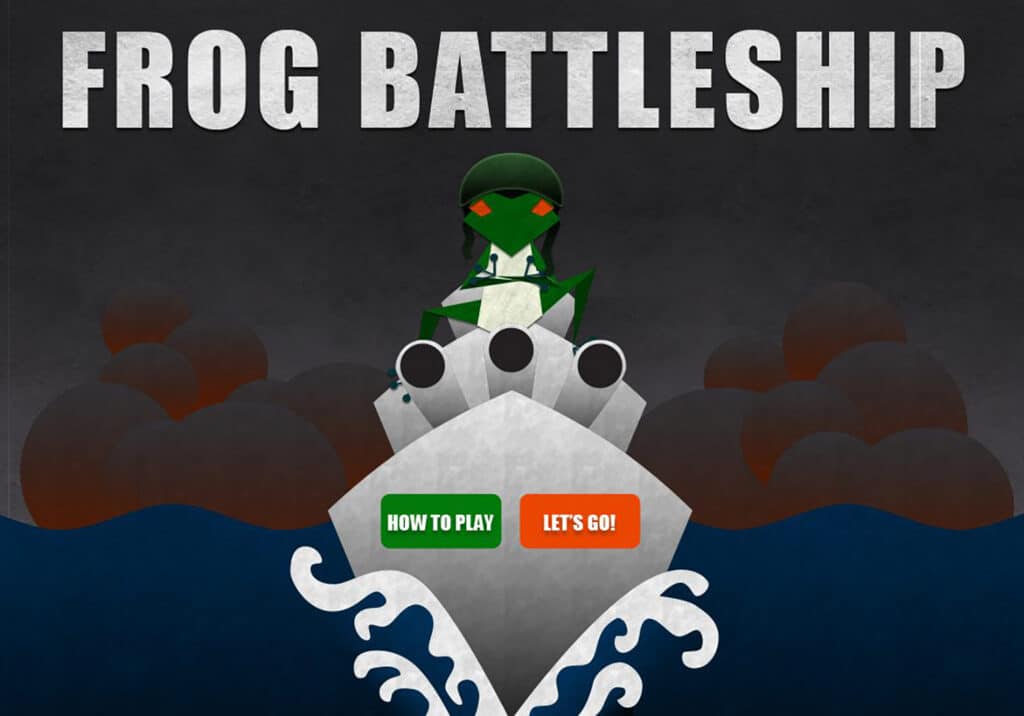
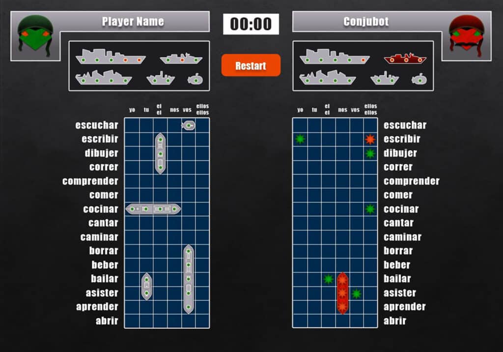
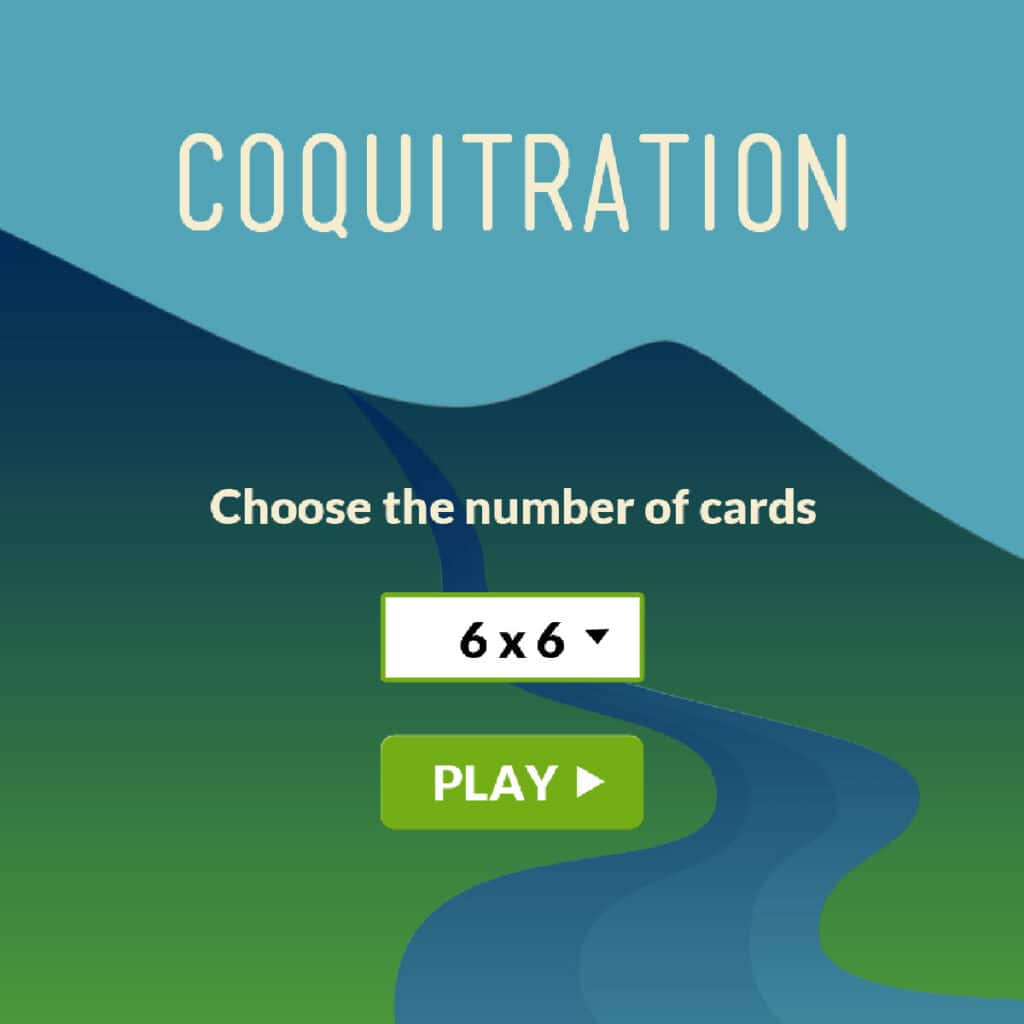
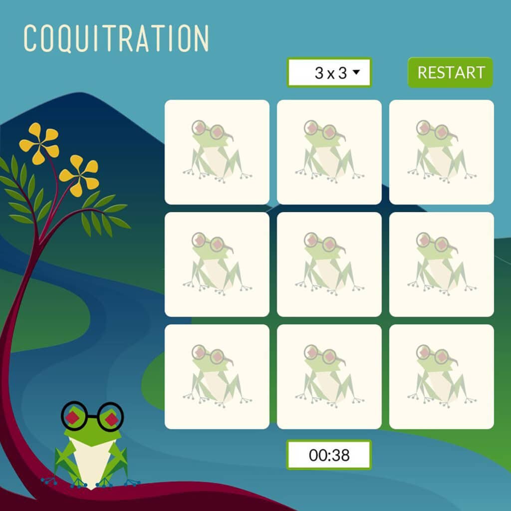
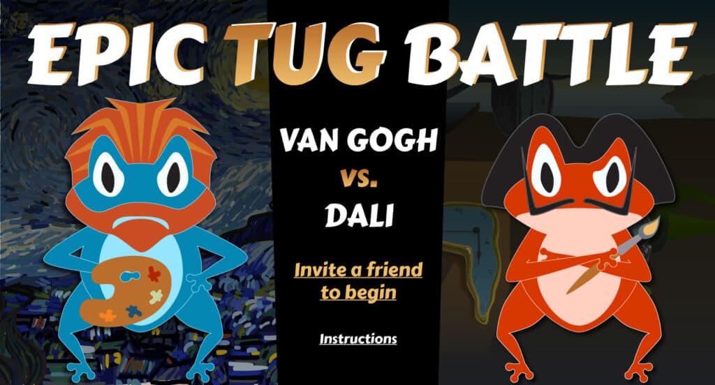
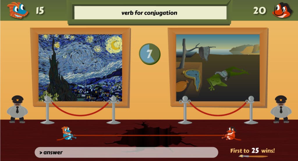
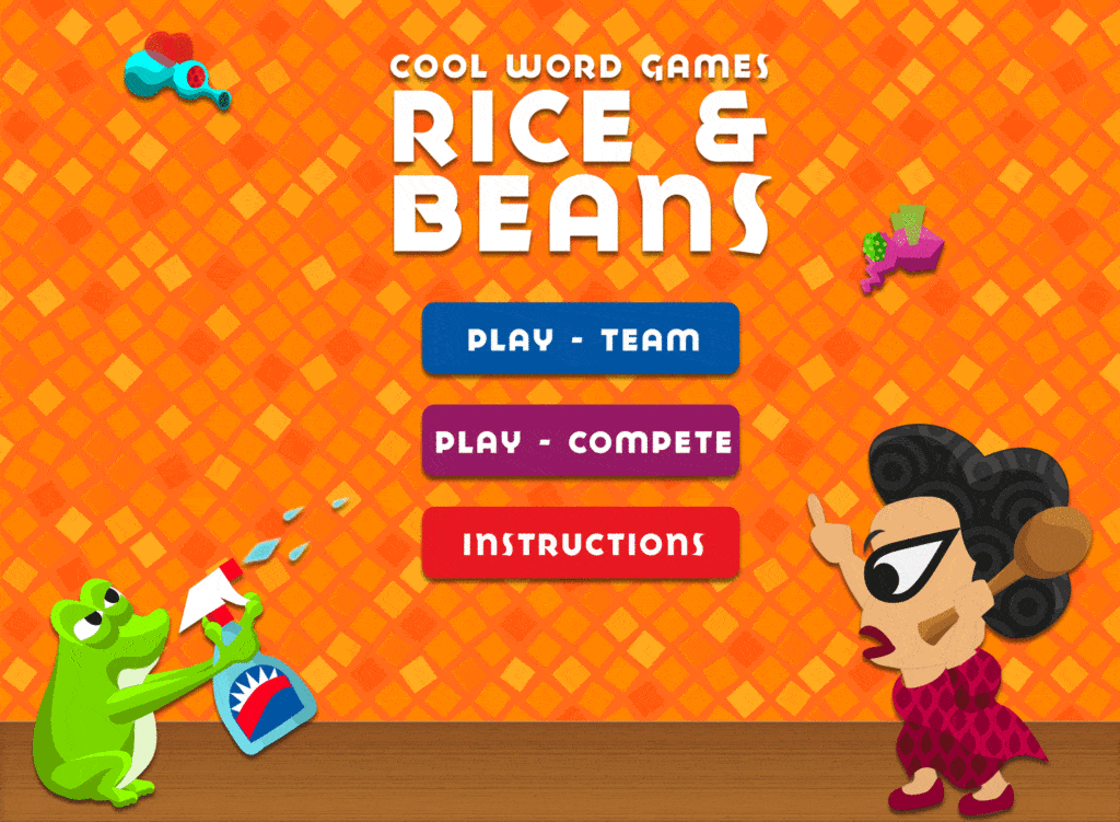
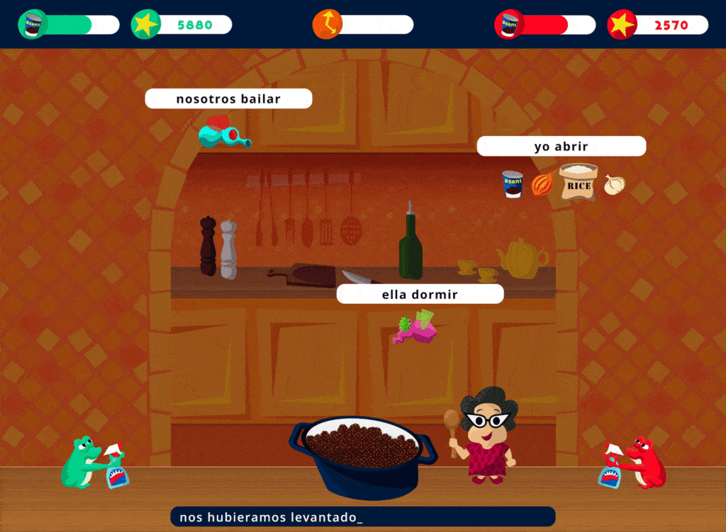
Realizing video games gave Conjuguemos a competitive edge over other online learning systems, such as Quizlet, he decided to add several games to the site.
Each game had its own unique style, but featured coqui to keep it tied in to the Conjuguemos theme.
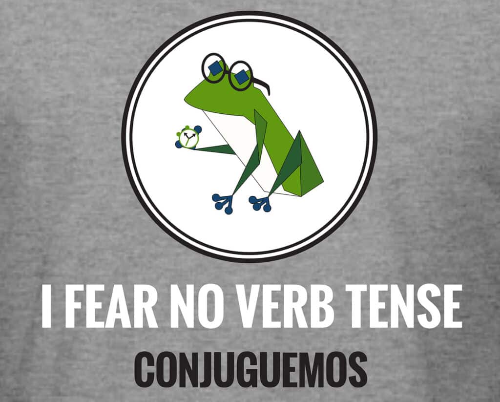
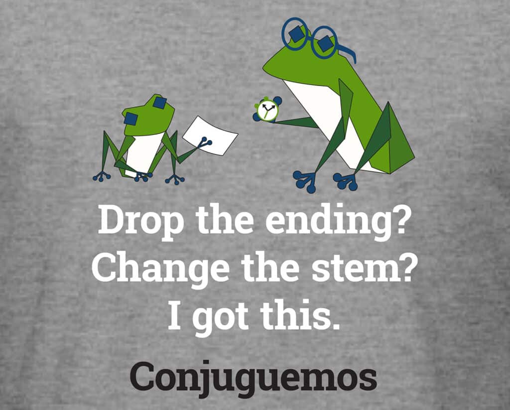
T-shirts
The creator of Conjuguemos wanted t-shirts to help spread the word of the site. Since they were aimed at students, he wanted them to be humorous so we added simple phrases to different images of the Conjuguemos frog. Then I simplified the graphics to make the bulk printing easier.
