TheTVDB Gamification
Awarding points to users for gathering data about movies, TV shows, and actors
My Role
UX Designer
Our Team
Programmer
UX Director
Lead UX Designer
UX User Researcher
Chief Executive Officer
Duration
5 months
Overview
Context
TheTVDB is a community-driven TV and Movie databases. With content metadata available for 133,000+ TV Series and 327,000+ movies, thousands of developers use theTVDB digital media metadata API to power their apps, utilities, and projects.
Objective
To improve the integrity of their data, TheTVDB wants users to contribute critical pieces of missing data to series, movie, and actor records. How could TheTVDB entice users to enter data?
Moreover, although the site has 25 active editorial moderators, how could we get users to enter the correct data and to report errors?
Solution
TheTVDB team had implemented the gamification feature but wanted to make improvements based on structural changes and on the results of user testing. I was tasked with the following objectives:
- Put together a style guide for TheTVDB based on designs by the Lead UX Designer.
- Create graphics for onboarding modals.
- Create wireframes of the gamification feature that addressed layout and user testing issues.
- Present designs at monthly meetings with TheTVDB Director, Lead Director, UX Director, UX Lead Designer, Content Operation Manager, and User Researcher, and iterate based on discussions.
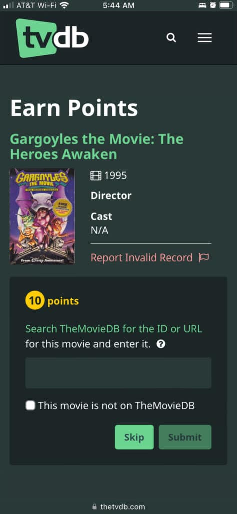
Tour of TheTVDB Gamification
Reflections
Being conscious of future UX designers
The previous UX designer had developed the gamification feature using Figma. However, the lead UX designer used Sketch for the rest of the site.
To streamline the process of applying new styles for myself and future designers I recreated the wireframes in Sketch so the next designer would not have to update styleguides in both programs.
Completing a design audit
Before implementing the new styles of the lead UX Designer, the UX Manager wanted an audit of the live site. Creating a detailed comparison of old and new components helped the developer with implementation.
The process helped me see that up to that point elements had been styled on-the-fly. It showed me how to create a more consistent experience for users.
Presenting to stakeholders and developer
I honed my presentation skills to defend my design choices and find the best solutions. Having regular meetings with TheTVDB team allowed me to iterate quickly based on our discussions.
The lead UX designer reminded me not to limit the designs on what I thought was possible because the developer could give feedback about what would be feasible.
Discover & Define
User test interviews
What’s the purpose?
Overall, users could not tell what kind of benefits they and TheTVDB could reap from the gamification feature. In their eagerness to start the game, they largely ignored the explanation of rewards and instructions.
Where am I? Where am I going?
Ideate
Onboarding
We decided to replace the text at the beginning of the game with fun modals that users could easily digest. These screens would highlight the benefits and logistics of the game.
Clear instructions and notifications
Pop-up instructional modals could show users exactly where they needed to go, and what information they needed to get. They could also inform users that they had submitted the entry correctly and would earn points upon verification.
Iterate
Onboarding modals
The team worked together to condense the copy on each modal. Just as we simplifiied the text, I also removed extraneous elements from the graphics to make them more straightforward.
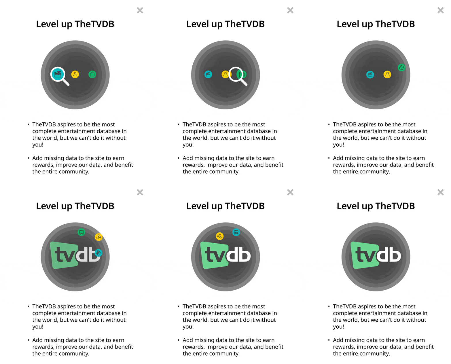
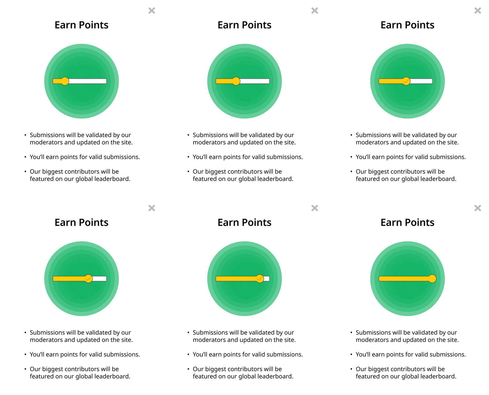

Earlier version of onboarding modals
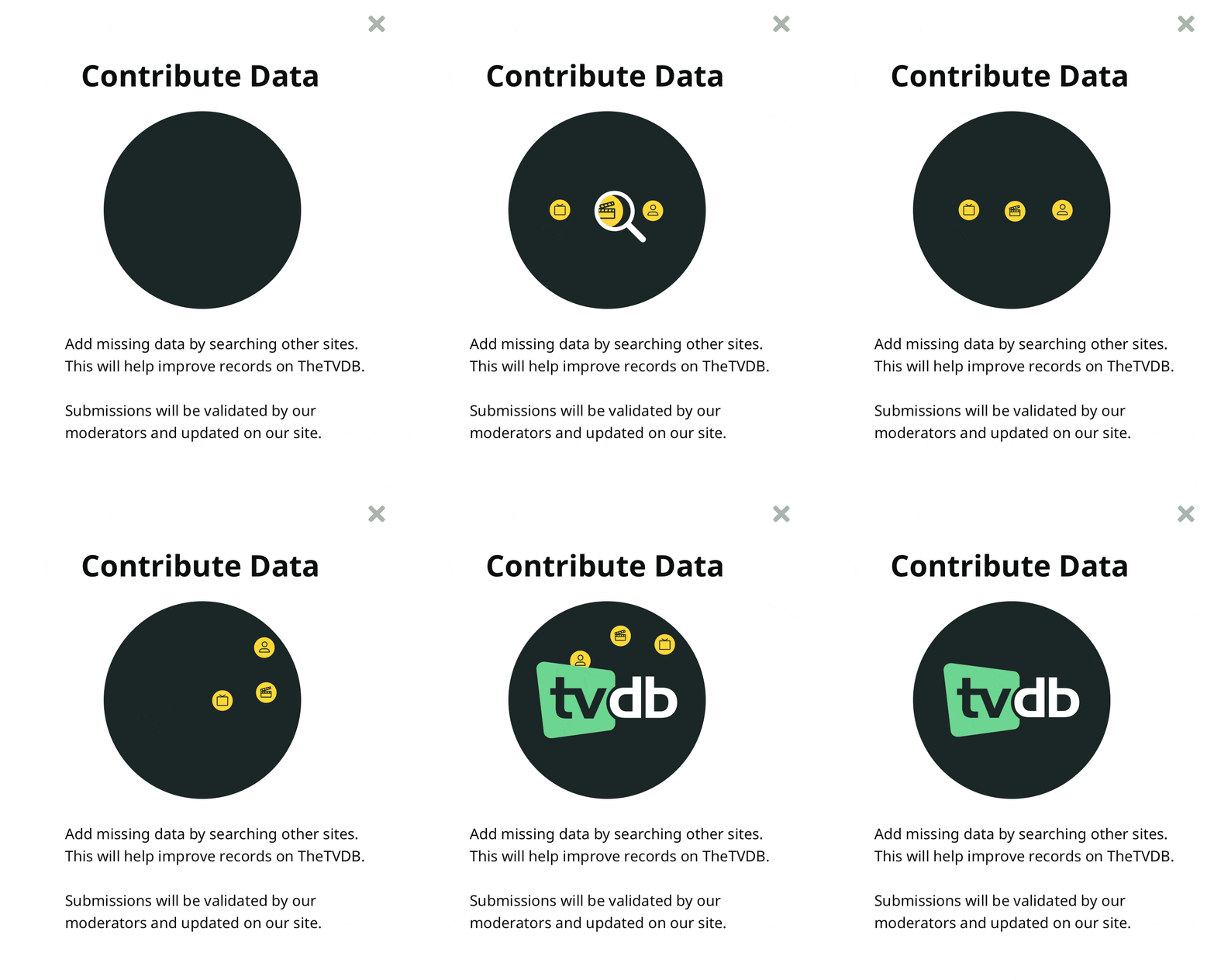
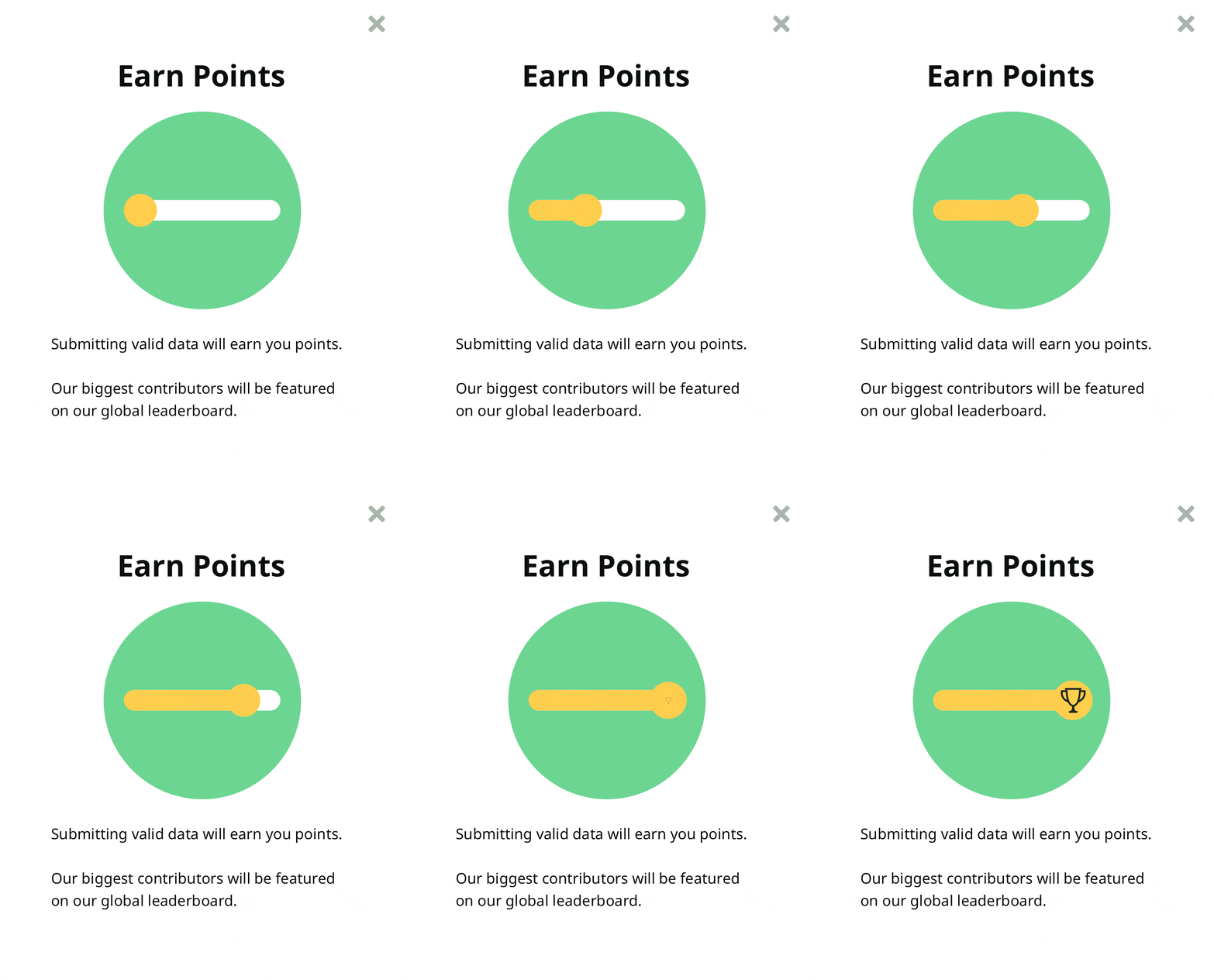

Final version of onboarding modals
Instructions
Initially, we tried to prime users for the sites they would be going to using the destinations’ colors for the buttons, but users were not familiar with them. The colors also got mixed up with TheTVDB color scheme.
I got rid of the button to make the interface clearer and put detailed instructions in a help modal.
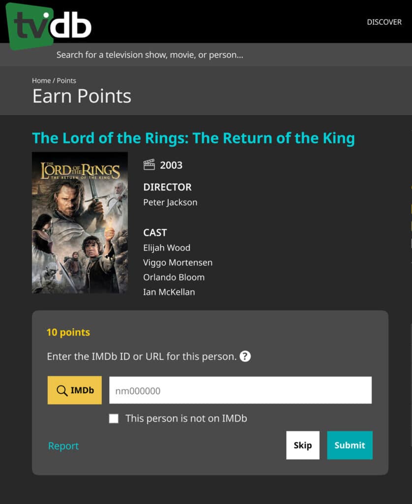
Users were too distracted to see this instruction
Then users did not know what to make of this button
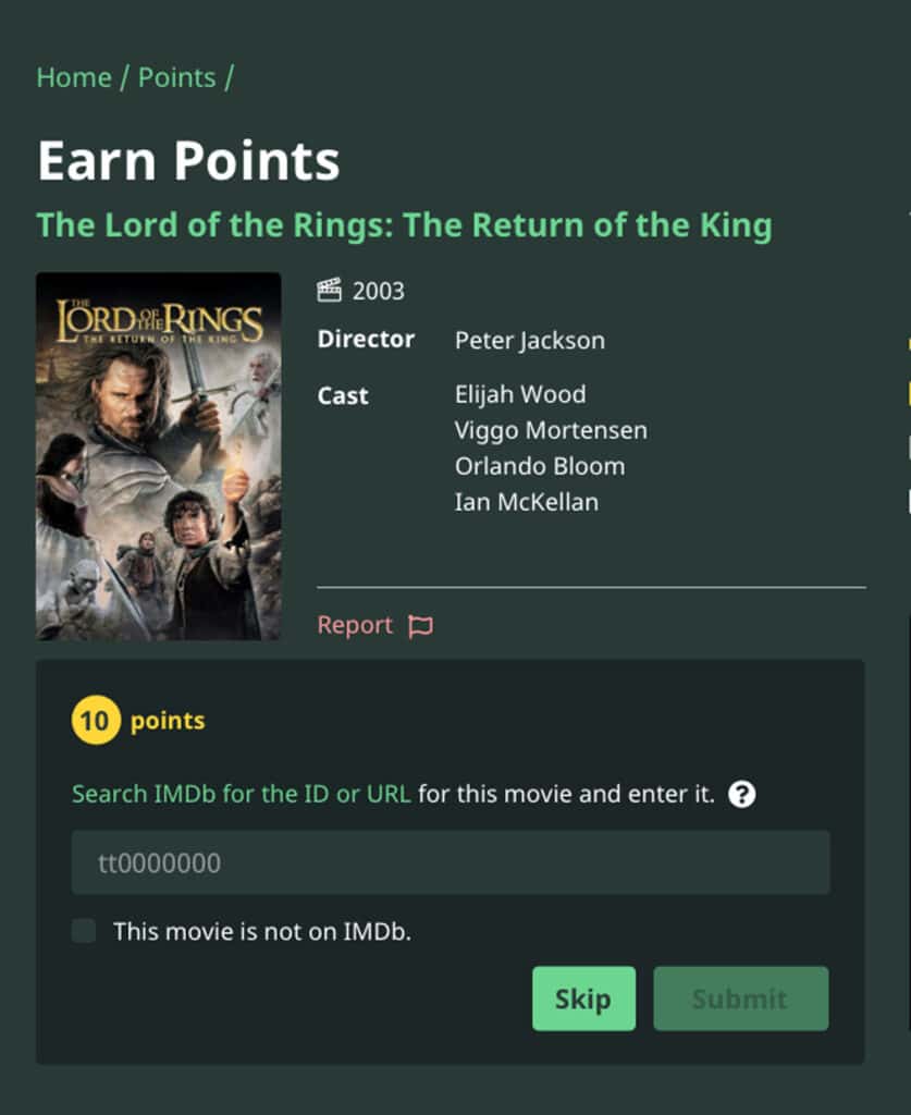
Turning the instruction into a link helped the flow and made the layout clearer.
Test
Reporting a record
Users can report a record for being adult content or miscategorized. During testing, the “Report” got lost amidst the available entry options and confused viewers.
We determined its purpose was more relative to the record information, so I moved the link up to the information section and highlighted it with an error color and icon.
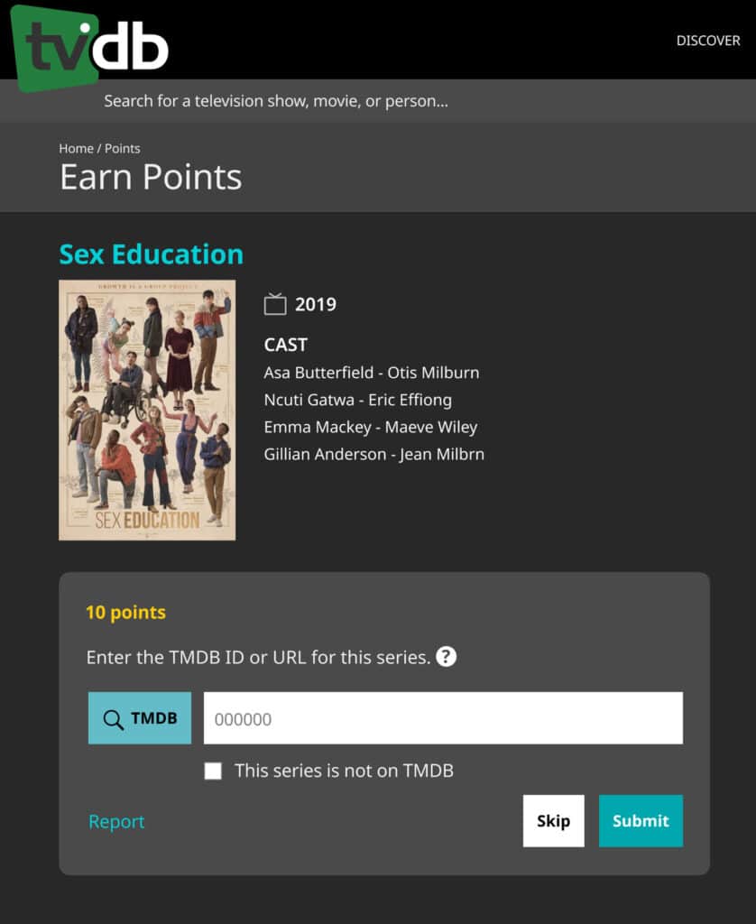
Users could not find the "Report" link among the other options
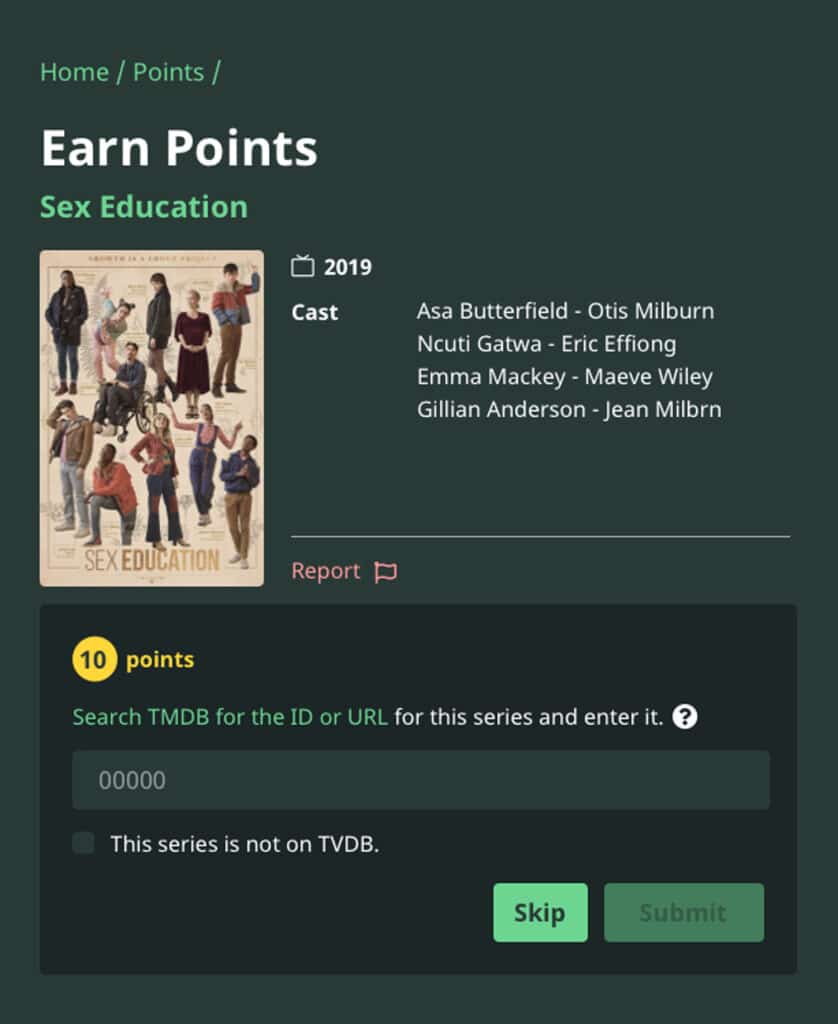
Adding a flag icon and moving the "Report" link to the information section helped users find it better
Design System
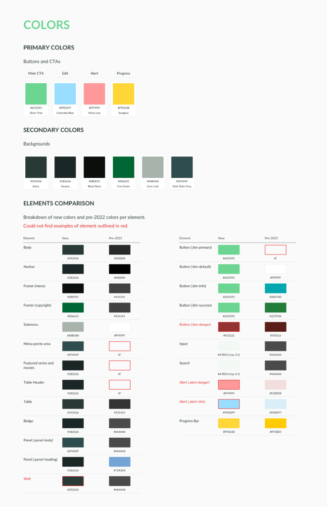
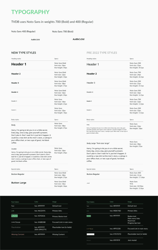
I developed a new design system for TheTVDB site. To facilitate its implementation, I audited the live site and created a chart comparing the old and new components.
Limiting the color palette made the site more cohesive and helped highlight CTAs. I also set styles for possible components to prepare for the future of the site.
