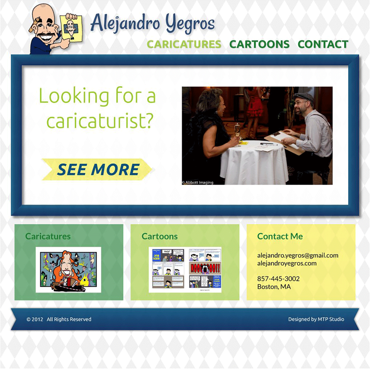
Concept
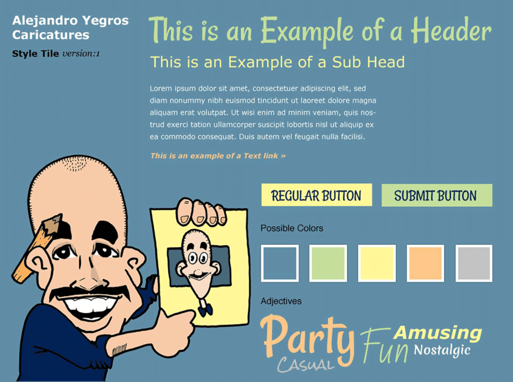
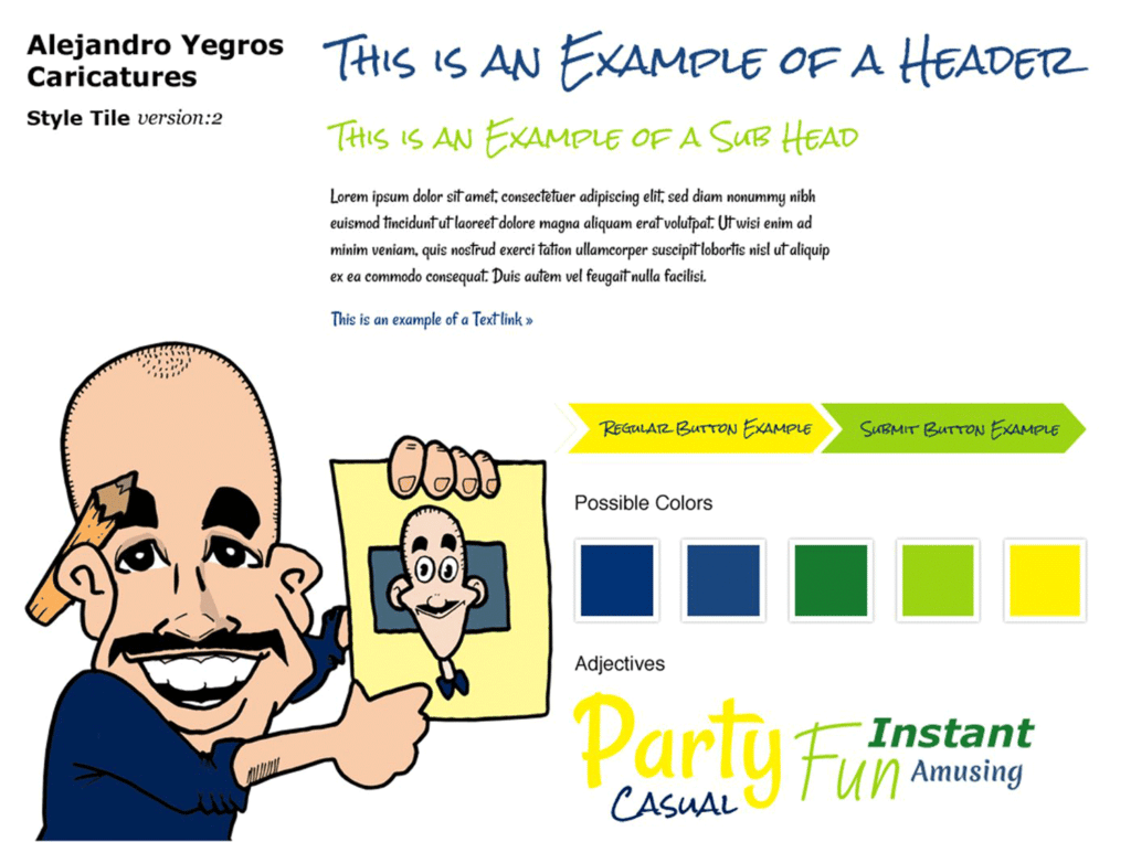
The caricaturist’s work was very fun and charming, so I wanted to echo those feelings in his website and cards. I started by creating some style tiles to capture the feelings.
One had a retro feeling using a lot of faded colors that reminded me of childhood birthday parties.
The client liked the energetic palette in the second style tile, but he was concerned the handwritten text would not be legible.
Postcard Flyers
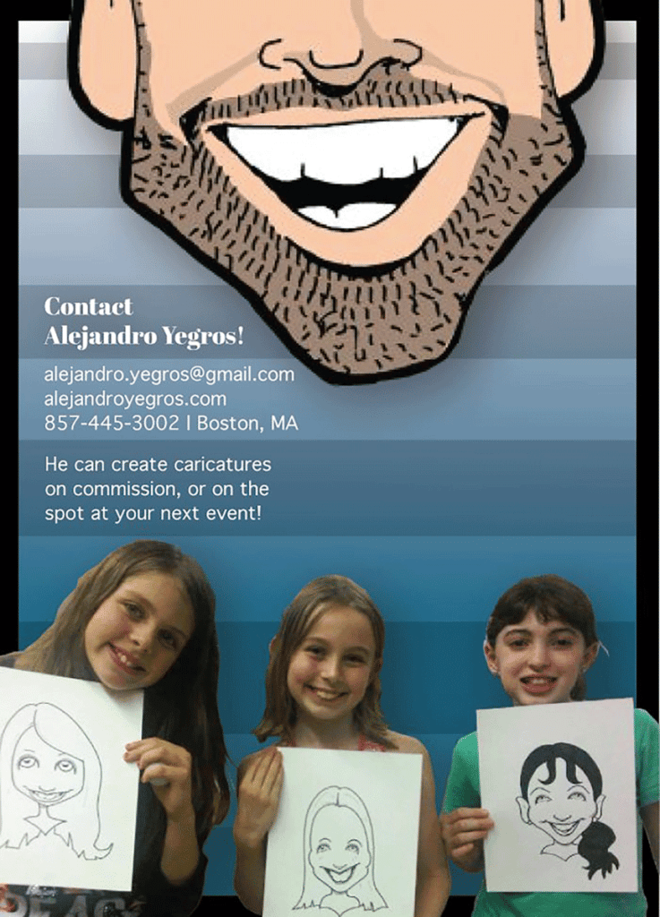
Version 1
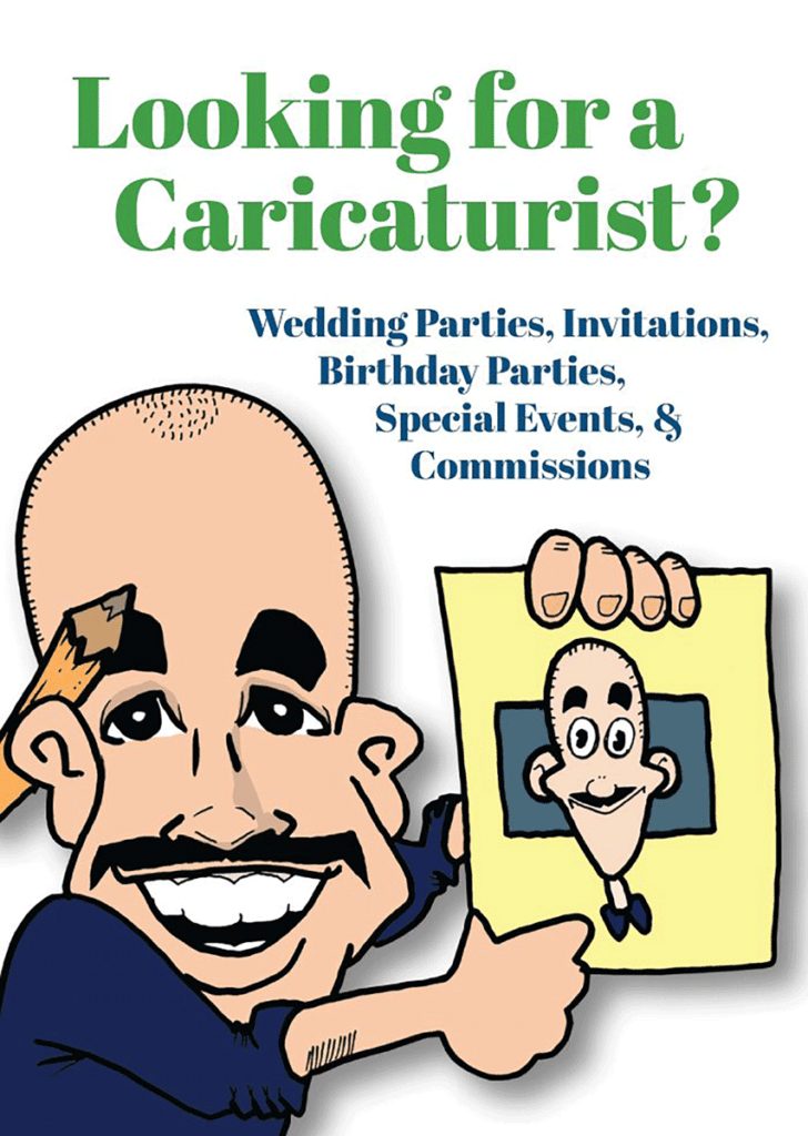
I featured the client prominently in the first draft. I liked the idea of his eyes being on the front – as if asking a question, and his mouth on the back provided the answer. But his face overwhelmed important information.
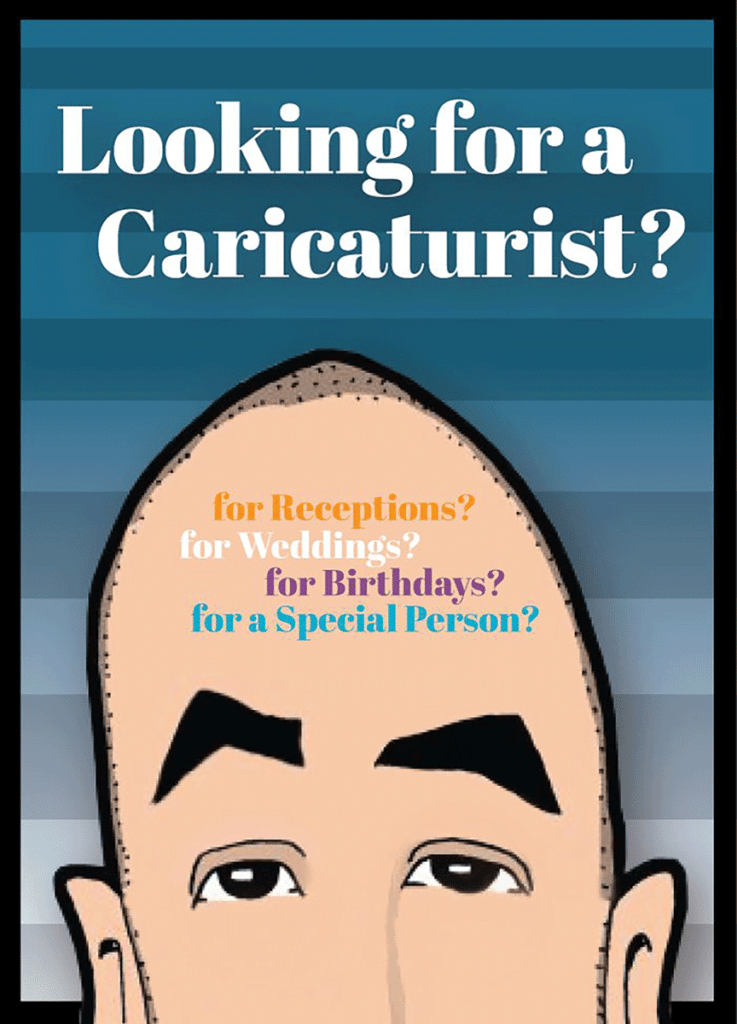
Version 2
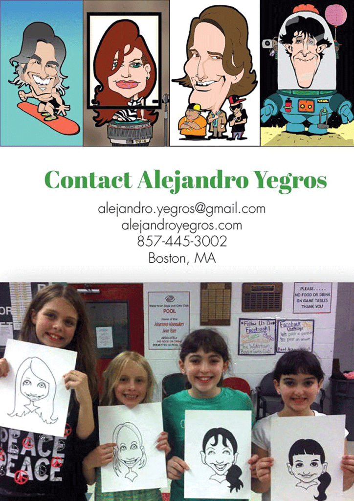
The client preferred the second version, which featured more examples of his work, and was more legible.
Website
I created a responsive WordPress site for the client with sliders that he could easily update. Each image had its own post that could be posted on his Facebook site as well so that he did not have to duplicate it. The posts automatically went into the sliders as well, depending on how he categorized them.
